Path 93 · The image laboratory · Intermediate
Serve the detail the layout actually needs.
A guided, practical route through responsive images.
What you will be able to do
Create a responsive image example with truthful alternative text, explicit dimensions and a documented source-selection test.
Plan about 9h 35m in total. Reading and practice are editorial estimates; video runtimes come from public provider metadata. Your pace will vary.
Table of Contents
Before you begin
Check your starting point
What you need
Basic HTML and CSS. Use the supplied original vector diagram and generated raster sizes; no stock imagery or paid editor is required.
The selected public provider lessons are free to view. The original case can be completed with paper, a text editor or freely available local tools. Paid exams, certificates, subscriptions and optional provider software are not required for this project.
Completing this Coursya path does not award a provider certificate. Any provider assessment, account requirement or credential must be checked separately on its official page.
Three readiness questions
Are CSS pixels always physical device pixels?
No.
Does alt text describe a filename?
It should communicate the image’s purpose or information.
Why declare width and height?
To establish aspect ratio and help reserve layout space.
Use a workable pace
At 5 hours per week, allow about 2 weeks. Start with Stage 1, continue in order and reserve 2h for the capstone. If a gate fails, use its repair step before advancing. At another weekly budget, divide 575 estimated minutes by your available weekly minutes and round up.
Keep a small evidence folder. A checked box means you reviewed your output; it is not a certificate or proof that a provider lesson was watched.
The working case
One diagram, three resolutions
A fictional tutorial card displays a diagram at up to 700 CSS pixels. The package provides raster candidates 350, 700 and 1,400 pixels wide with the same 7:4 aspect ratio. The browser selects a candidate using layout, pixel density and its own conditions; exact selection is not guaranteed by markup alone.
| Candidate width | Height | Aspect ratio |
|---|---|---|
| 350 | 200 | 7:4 |
| 700 | 400 | 7:4 |
| 1400 | 800 | 7:4 |
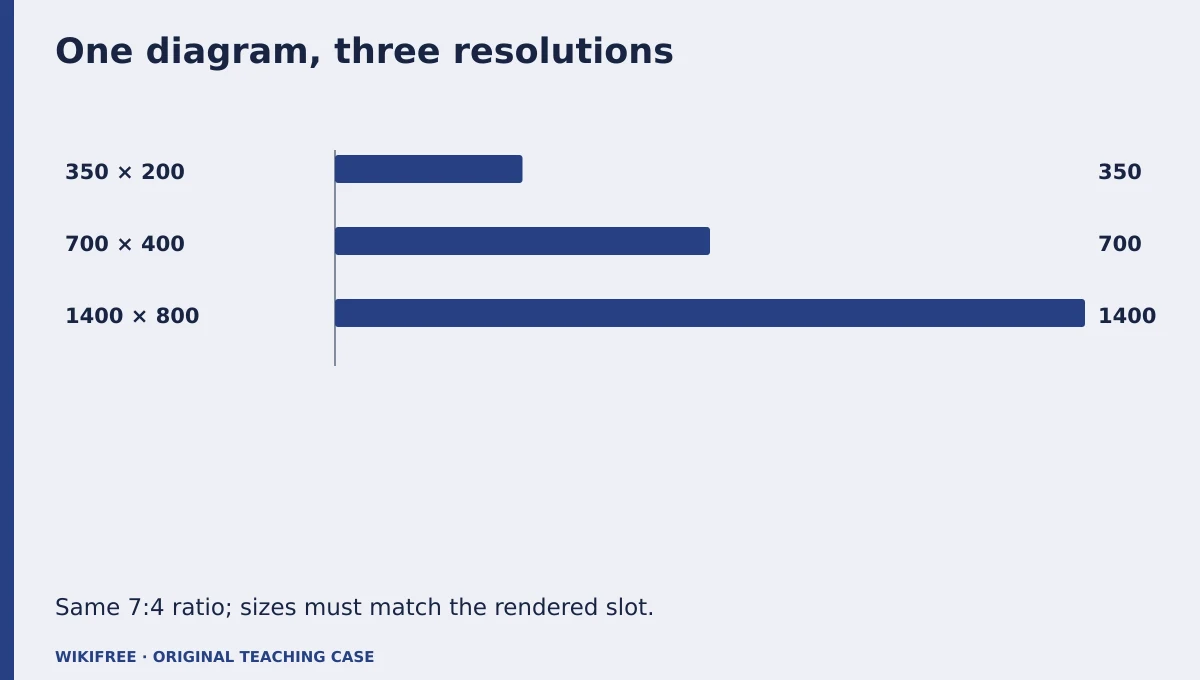
The table and explanations preserve the essential case information when the diagram is unavailable.
Your route
Five outputs, then a final handoff
- 01Understand image representationAsset inventory
About 1h 35m including assigned learning and practice. - 02Describe the source choicesResponsive markup
About 2h 5m including assigned learning and practice. - 03Reserve space and preserve meaningAccessible image block
About 1h 5m including assigned learning and practice. - 04Distinguish art directionMarkup rationale
About 1h 35m including assigned learning and practice. - 05Inspect actual browser behaviorImage test log
About 1h 15m including assigned learning and practice. - FINALCapstone reviewCombine the evidence into one inspectable handoff.
About 2h .
0 of 6 outputs checked. JavaScript adds browser-only progress saving.
The complete lesson and all downloads remain available. Use the printable project workbook to track your progress.
Use the minimum useful source material
The courses behind this route
Google Learn Images: Free Responsive Images Course
The published web.dev image course covers vector/raster formats, srcset, sizes and picture.
Selected material only; this path does not claim completion of the entire provider course.
Course publication and selected public lesson metadata were checked on 13 October 2026. This is not a claim of full video playback, provider-course completion or permanent availability. Recheck the linked source if a lesson changes.
Learn, make, inspect
The five-stage workshop
Understand image representation
Video 0m · reading budget 40m · original practice about 55m.
A precise diagram can remain vector-based, while raster variants are useful for testing responsive markup. Preserve the same content across variants so size selection does not change meaning. The case uses an original educational diagram rather than decorative stock photography. File dimensions and byte size answer different questions.
Assigned reading
Google Learn Images: Free Responsive Images Course: Vector images, raster images and key performance issues.
Use the named provider navigation sections. Editorial reading budget for the named public material; not a verified completion duration
Do the work
Inspect the SVG and the three raster candidates.
Save this output
Asset inventory
Pass the review gate
Each variant has the stated ratio and the same diagram content.
If you need another attempt
Compare dimensions rather than assuming a filename is accurate.
Describe the source choices
Video 0m · reading budget 45m · original practice about 1h 20m.
Use width descriptors in srcset and a sizes value that reflects the actual CSS layout. The browser uses those hints rather than a simple device-name rule. A misleading sizes value can cause an unnecessarily large download. Keep a normal src fallback and a meaningful alt description.
Assigned reading
Google Learn Images: Free Responsive Images Course: Responsive images and descriptive syntaxes.
Use the named provider navigation sections. Editorial reading budget for the named public material; not a verified completion duration
Do the work
Build the responsive image element for a 700-pixel maximum layout.
Save this output
Responsive markup
Pass the review gate
Descriptors match actual raster widths and sizes agrees with the CSS.
If you need another attempt
Measure the rendered slot before editing the candidate list.
Reserve space and preserve meaning
Video 0m · reading budget 0m · original practice about 1h 5m.
Explicit dimensions establish the intrinsic ratio so the page can reserve space before the image loads. Alternative text should convey the diagram’s relevant relationship, while nearby text can provide detail. Do not duplicate a long caption word for word if it makes the reading experience repetitive.
Original application stage. Use your preceding outputs and the supplied case; there is no additional required provider lesson.
Do the work
Add dimensions, alt text and a concise text equivalent.
Save this output
Accessible image block
Pass the review gate
The information remains understandable with the image unavailable.
If you need another attempt
Describe the relationship shown, not merely a colorful diagram.
Distinguish art direction
Video 0m · reading budget 35m · original practice about 1h .
The picture element can select different compositions when the visual information must be framed differently. That is distinct from offering the same image at multiple resolutions. This case uses resolution switching, so extra art-direction markup is unnecessary unless a meaningful small-screen composition is created.
Assigned reading
Google Learn Images: Free Responsive Images Course: Prescriptive syntaxes.
Use the named provider navigation sections. Editorial reading budget for the named public material; not a verified completion duration
Do the work
Explain whether the case needs picture or a single img with srcset.
Save this output
Markup rationale
Pass the review gate
The rationale separates composition changes from resolution changes.
If you need another attempt
Use the simpler structure when every candidate has identical content.
Inspect actual browser behavior
Video 0m · reading budget 0m · original practice about 1h 15m.
Test at two viewports and inspect currentSrc, rendered width and image dimensions. Cache and device scale can affect selection, so record conditions and avoid asserting a universal candidate. The prepared files can be checked locally; production CDN behavior would need separate verification after deployment.
Original application stage. Use your preceding outputs and the supplied case; there is no additional required provider lesson.
Do the work
Record candidate selection and layout at desktop and mobile widths.
Save this output
Image test log
Pass the review gate
Actual currentSrc values are recorded, not guessed from viewport alone.
If you need another attempt
Clear or account for cache when comparing requests.
Make the result inspectable
Your final project
Deliver the source diagram, three raster candidates, responsive HTML and two-viewport inspection log. Show that removing the image still leaves a useful text equivalent.
The ZIP includes synthetic input data, a project workbook, worked reference, evidence log, scoring rubric and case-specific materials. Code projects include source and clearly stated local execution requirements.
Use one consistent rubric
| Criterion | Maximum | Evidence |
|---|---|---|
| Evidence and correctness | 30 | Calculations, source use and results match the supplied case; limitations are honest. |
| Required artifacts | 30 | All five stage outputs and the capstone handoff are present and inspectable. |
| Reasoning and decisions | 20 | Choices, assumptions, alternatives and the case-specific critical condition are explained. |
| Reproducibility | 10 | A reviewer can follow the stated steps and distinguish expected from observed results. |
| Clear communication | 10 | Labels, units, structure and evidence references make the work easy to review. |
Score at least 80/100, supply every required artifact, and satisfy the path-specific critical condition. Rework missing evidence before marking complete.
The critical condition
Candidate descriptors match real file dimensions and browser source selection is observed rather than promised.
Compare with a worked reference
All candidates share width/height = 1.75. A 700-CSS-pixel slot on a high-density screen may need more than 700 source pixels, but the browser ultimately chooses. The test report should record currentSrc instead of claiming that every mobile device downloads the 350-pixel file.
Know the boundary
This is a local responsive-image exercise, not a verified production CDN configuration or a bandwidth guarantee.
Questions before you finish
Do I need to finish every source course?
No. This path names selected lessons or reading sections. Complete the full provider course only if it supports your wider goal. The path does not claim equivalence to that course.
How do I know when to advance?
Use the output and review gate in each stage. If evidence is missing or a result conflicts with the case, follow the repair step and retry before advancing.
Can I do the project without paid software?
The selected public provider lessons are free to view. The original case can be completed with paper, a text editor or freely available local tools. Paid exams, certificates, subscriptions and optional provider software are not required for this project.
What does my checklist prove?
It records your own review in this browser only. It does not verify viewing, skill, a provider credential or a real-world deployment.
What if a lesson or tool changes?
Use the linked course and provider page to inspect current availability. Record the change and revisit the relevant assignment; do not invent a replacement lesson or claim an unavailable activity was completed.
Questions & discussion
Share a useful question or correction. Comments appear after moderation. Please avoid personal or sensitive information.