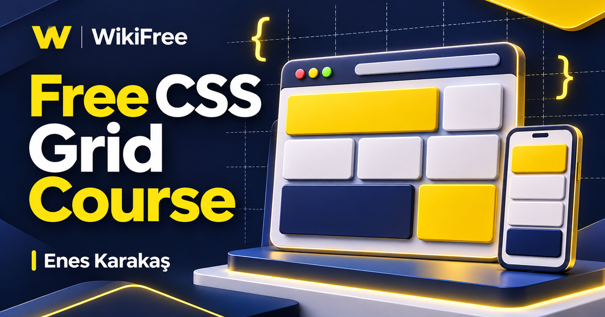
Listed as Free on Udemy when checked on 7 November 2026. No coupon or subscription trial is required for the listed lessons. Enrollment needs a Udemy account; availability can change.
About this course
A web page can look simple while depending on several different layout decisions: which content belongs together, how columns share space, and what should happen when the screen becomes narrow. CSS Grid gives you a way to express rows and columns as a system. Enes Karakaş introduces that system through explanations and two practice projects in CSS Grid Course.
The free English course contains six videos in one section, with a combined running time of one hour, fifty-three minutes and thirty-eight seconds. One downloadable resource is listed separately. Basic HTML and CSS knowledge and an editor are the stated requirements. The source labels the course All Levels; its focused introduction is a useful next step for beginners who can already create and style a simple page. The recording was last updated in September 2022.
| Official course | CSS Grid Course (2022) |
|---|---|
| Created by | Enes Karakaş |
| Platform | Udemy |
| Language | English |
| Level | Beginner |
| Listed duration | 113 minutes; 6 lectures across 1 sections |
| Completion terms | Not included with a new free enrollment |
What you’ll learn
Explore grid containers, rows, columns, lines and named areas. Compare explicit tracks with tracks created through automatic placement, then study alignment and individual item placement. Follow the progression from a smaller layout project to a larger one, using the examples to connect property choices with the structure of a page.
Skills you’ll gain
- Grid vocabulary
- Track sizing
- Named grid areas
- Automatic placement
- Grid alignment
- Responsive layout reasoning
Name the parts of the layout
The opening overview introduces the vocabulary that makes later property names easier to understand. A grid line marks a boundary; a track is the space between adjacent lines; an area can cover several cells. Before changing code, sketch the intended arrangement and label those parts. This simple preparation helps separate the shape of the layout from the content placed inside it.
Study properties in small groups
The main properties lesson is the longest video in the course. The description identifies container settings such as grid-template-columns, grid-template-rows and grid-template-areas, alongside item placement properties. Study one small group at a time. Changing the number of columns, the size of a row and the position of an item simultaneously can make it difficult to explain which change caused the result.
Reason about available space
Track sizing is a good place to build that habit. Fractional units distribute available space among flexible tracks; they do not simply divide every pixel of the container regardless of other content. Fixed tracks, gaps and content constraints also matter. Try a short heading and then a much longer one, and inspect how the layout responds rather than checking only the tidy example.
Expect the content to change
Explicit and implicit grids solve different parts of the placement problem. You can declare an initial set of tracks, yet additional items may require more tracks. The syllabus includes grid-auto-columns, grid-auto-rows and grid-auto-flow, which help explain that behavior. Ask what should happen when a seventh card enters a layout designed with six cards, instead of treating the first screenshot as the only possible state.
Align at the right level
Alignment adds another useful distinction. Aligning an item within its grid area is different from distributing the grid’s tracks within a container that has spare space. Properties such as justify-items and align-items address a different level from justify-content and align-content. Keep the relevant axis and writing mode in mind, and use a clearly visible container boundary when testing your assumptions.
Learn from two practice projects
The two project lessons provide a change of pace after the longer property explanation. The instructor describes a smaller first project followed by a larger application of the ideas. Use that sequence to practice reading an existing arrangement, predicting the effect of a change, and checking the result. A completed demonstration is a starting point for practice, not proof that every possible content length or screen size has been handled.
Choose Grid and Flexbox deliberately
Grid and Flexbox can also coexist. The course introduces their relationship, but choosing one does not require banning the other from a page. Grid is especially useful when rows and columns need coordinated placement; Flexbox is often convenient for a group arranged along one main axis. Choose according to the relationship between the elements, and keep the resulting structure understandable.
Try a reading-list layout
As an optional editorial exercise, create a reading list with a heading, a short introduction and several article cards. Start with a sensible HTML reading order, then arrange the cards into columns when there is enough space. Add a very long title and remove one card. Explain which tracks were declared and which appeared automatically. This is a suggested practice exercise, not an assignment supplied by the instructor.
Keep visual and reading order coherent
Preserve that logical order while experimenting with placement. Moving a card visually with grid properties does not automatically move it in the document or change ordinary keyboard navigation order. Test the page with the keyboard as well as by resizing it. If the content only makes sense after a visual rearrangement, revisit the HTML structure instead of relying on placement rules to repair the meaning.
Build a foundation you can explain
The course offers a focused foundation in layout, rather than a complete web development curriculum or a promise to cover every later Grid feature. Keep current CSS documentation beside the recordings when extending an example. By the end of your own practice, aim to explain why each container and item rule exists, and how the page should behave when its content changes.
Related courses for your next step
- Refresh selectors and the box modelExplore CSS Basics
Strengthen the styling foundations that support layout decisions.
Beginner
Frequently asked questions
Is this a complete introduction to HTML and CSS?
No. Basic HTML and CSS are prerequisites; the course focuses on CSS Grid layout.
Are there practice projects?
Yes. The public syllabus includes two project videos, following the overview and main properties lesson.
Does the course include every modern Grid feature?
The recording dates from 2022 and covers a focused set of layout properties. Use current documentation when extending its examples.
Questions & discussion
Share a useful question or correction. Comments appear after moderation. Please avoid personal or sensitive information.